Thursday 28 October 2010

A Precedent A Day. Entry #11: Universiteitsbibliotheek Utrecht


Following the precedent analysis of Netherlands architecture, this building is a continuation from the study trip. As a part of buildings from University of Dundee, this building translated directly into University Library of Utrecht, this piece of architecture is designed by Wiel Arets Architects. Surrounded by various architecture of surrounding buildings, the library stood out with its modest yet rigid exterior that translate as being a lone independent building.


The planning of the entire design of its entirety was taken up to a period of seven years, whereas the construction of the building took three years, half the amount deciding the plan of the building, which is safe to say that the building has been thoroughly prepared and planned.

.
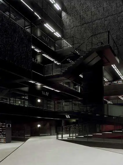
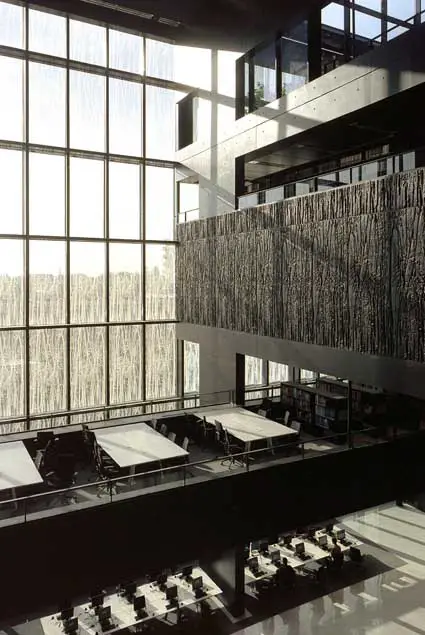
The detailing, through its seven-year long process of analysis and consideration is complimented for its utilization, together with its aesthetic value. The most intriguing part of the building lies not on its exterior but rather to its interior where every feature is meant to have its own purpose, small or big.

Elements of bamboo leaves are featured on black rectangular panels that are administered as main elements that basically create the library from its wall to its interior. The outer part of the library is cladded with these panels entirely, where one panel illustrates one floor of the building. Whilst lined up as exterior wall of the building, some of the panels at random would extruded outwards to let in natural light into the building, a feature that proved to be essential for a building with a theme color of black. Such color creates elegance and illusion of solidity, beneficial to a place where people retreat to be in a comforting environment where students can study.

On the entrance, one hollowed structure leads upwards towards a skylight on the roof. This clever feature is situated on top of the main stairs leading to the library where it is argued to be high on its level of social interactions between students to and from the inside of the library. High sound intensity would be bounced upwards to the hollowed area where it will dissipate and gradually fade on top of it, hence ensuring quiet environment inside the library area.


Personally, this building appeals as being an elegant exotic building. With its black color, Universiteitsbibliotheek Utrecht gives a charm that pleases visitors to simply appreciate its bold rigid design. The interior of the library seem to overpower the exterior, making an admirer to be able to truly appreciate design by only entering and walk on every levels of the library. The strong geometric elements of the interior is not being complimented by the organic design on each panel that covered the exterior of the library. Plus, the bamboo design looks like splatters of birds' poop.

A Precedent A Day. Entry #10: Wozoco Apartment


Celebrating the study trip to the Netherlands, it would be highly appropriate if the precedent review would be of buildings from the country, some architecture viewed and analysed along the 5-day journey around Holland, hence presenting the Wozoco Apartment.


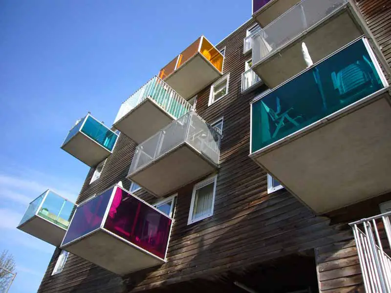
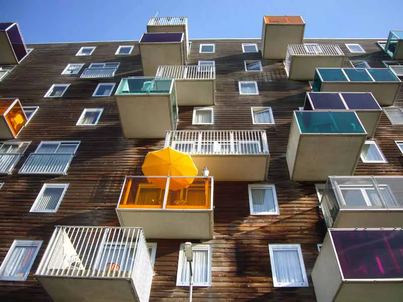
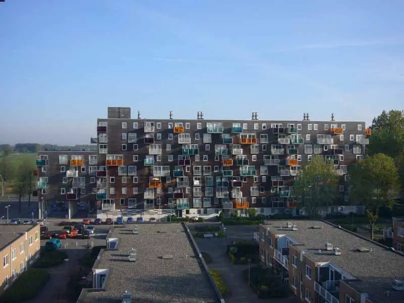
Wozoco Apartment lays on the outskirts of Amsterdam and designed by MVRDV Architects. Commissioned by Het Oosten Housing Association , this housing accommodates 100 flats that are occupied by elderly of the area. Disguised as an apartment rather than an old folks home or a nursing home, it distracts from the cliche image of a centre where old people live with caretakers around to care and nurse them in a hospital-like environment.


The original plan by Cornelis Van Eesteren regulated 87 units of apartments per block, where each tenant is promised natural good lighting. Then, the client requested the number of units to be increased by 13 to 100. It proved to be a challenge as the idea to accommodate 13 additional units would have to occupy another floor, a feature that would limit the green common space. Hence, the design of the building, deemed to be provocative and simply original.

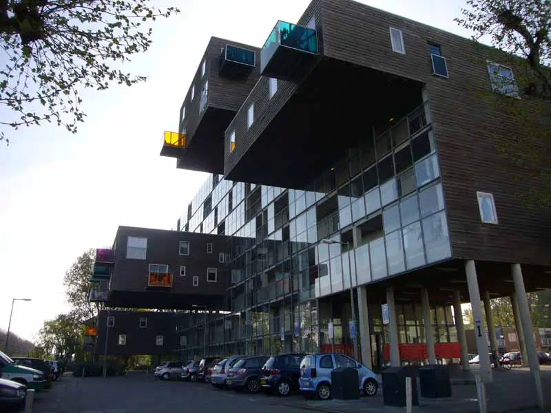
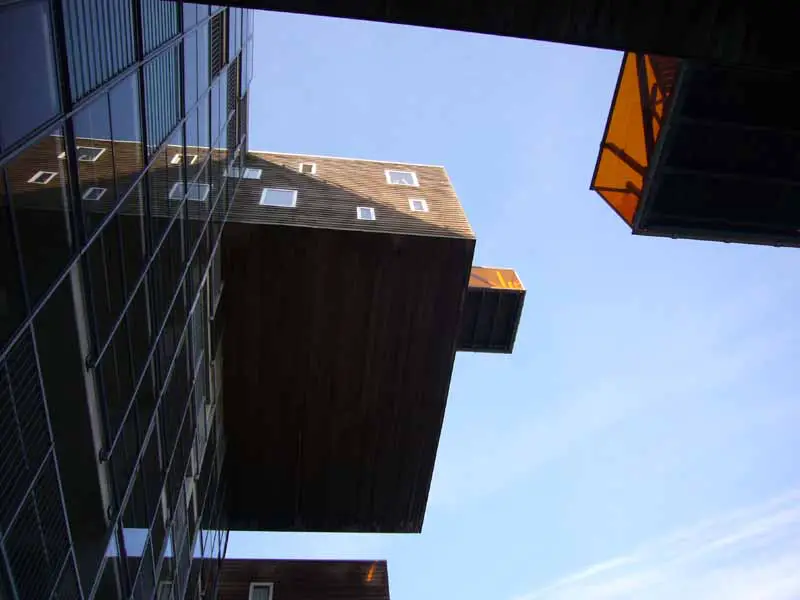
The design of the building includes extruding elements from a single box of a building, creating "hanging" structures to the back and front, that would actually place the additional units of flats. Apartments facing the back of the building is completed with a verandah each, with various elements of panels, colors and structures to enhance individuality of each unit. Such feature, random as it seems with some verandah extruding out from cantilevered elements, manage to appear organized as different colors of panels compliment each other with a bold hint of playfulness, shying away from the impressions of old age and death, ironic to its design of modern and contemporary.

The back of the building spreads a garden of flat space, enhancing the quality of light into the verandahs of the flats, cantilevered or not. These would also benefit residences to have a better view, as adjacent buildings to the Wozoco Apartment were low structures that accommodate nurses and caretakers of the old folks in the apartment. The front of the flat, on the other hand is covered with glass panels and wooden cladding on its cantilevered structures, simple without any complexion.


Wozoco Apartment is intriguing as an idea of a modern design that accommodate seniors, two elements that contrast yet compliment each other. The design is also amazing as a structural execution where big elements that cantilever on both sides of the buildings would be able to hold and even accommodate a few apartments. I find myself intrigued by the design and is amazed by its simplicity and complexity that appear to create high aesthetic value and its honesty to appear beautiful without any internal statement where it tries to be meaningful and deep.


Tuesday 19 October 2010

"oh, another blog?"

Stepping to a brand new year, a brand new semester, it does seem a little exciting to realize that I have indeed endured one year of architecture studies in a new country which indefinitely brought me to realizing that I have another three years in this amusingly boring place of Dundee to be blessed upon. The new semester saw me entering a little later than usual which was basically becoming a norm for me lately. Greeted with a brand new project, it was a bit overwhelming after three months of dead lifestyle at home and was unusually happy to be able to design again for the new project, the Shelter project.

The design for this project was undeniably a page taken off from the concept idea of the design from my previous project, the Tower project from the second semester from the first year. The design of the shelter, which was a resemblance of the previous project of rotating elements to the top, which applied to this particular project, a plank. The basic concept for the shelter was to have bottom planks which act as steps and then seats, while the upper part of the planks act as a roof, a complete shelter.

Designing for this project also required one to be attentive to details and even the construction of the whole structure, basically defining in clarity as if constructing the design in a real life situation. With a pole penetrating the centre of the design, it gave a complying connection of touching planks which acted as glue to hold planks together. But alas, the construction was controversial as the durability of each plank horizontally was questioned and justified.

This particular project was overwhelming because the best three designs were to be constructed professionally as a permanent structure on each respective site. Alas, my design was not picked as a final product to be glorified as a complete structure. The follow-up for the project was to assemble other undeserving designers of the shelter project to then create a team which will finally construct the design from scratch to a final structure appropriate on the site, managing from raising own funds to cover the costs of the construction to erecting the whole shelter from ground.

The managing design which I was happily, without any regards at all that I was actually dejected as I have created a design unworthy to an amazing standard, to assist the design by Aoife O'Donnell. The design illustrated an A-shaped hollowed pathway with seats placed inside which through much construction and democracy of adding i's to every single name suggested, branded as The Crux. The team was divided into groups which was to be handling certain aspects of the construction of the site, namely the making and designing, the fundraising and the documentation. I placed myself somehow into the group to documenting, which job was to capturing every detailing of the construction of the shelter from start to finish. Through some discussion with the group or just basically casual talking, I landed myself to another gig of actually writing a blog regarding every little journey of the creation of the shelter, at which I surprisingly find myself agreeing to do. With that, I basically am in charge of another blog, one particular blog I am required to write on every single day as a mere contribution of the team of The Crux. Crux Rox?

The blog for The Crux project is as followed; www.theawesomecrux.blogspot.com

To retract, the blog was discontinued due to some miscommunication with fellow teammates.