Saturday 27 February 2010

A Precedent A Day. Entry #8: PACO House


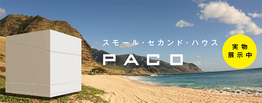
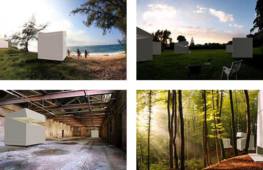
This particular design approaches as an innovation rather than basic home design. Initiated by Jo Nagasaka and Schemata Architects, the house is produced in mass, making it a product rather than a design building. This unconventional approach of a habitat proved to be a working design. Measuring at three metres square, this design compliments its simple shape without disrupting the surrounding, due to its space efficiency and its feature that is easily assembled, making the possibility of geographic placement is endless.


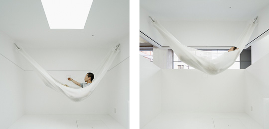
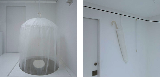
The look of this house is simply chic and elegance. Plain sleek white square, it appeals as a with a lid that can be opened or shut, committing completely with having full natural light into the home. Like mimicking a child's simple mind to keep a miniature pet inside a box, it resembles just as that- a small box that serves all the basic of human necessities.


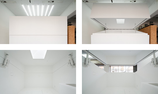
The beauty of the house, does not lie in the aesthetic of the exterior of the building, but rather inside, where the innovation of the architects is cleverly underlined and capitalized. The interior, though one room, is completely utilized with features of different needs - hammocks as sleeping quarters, waterproof partition wall as shower space, pop-up toilet, concealable table for dining which also includes additional sleeping space and storage space.


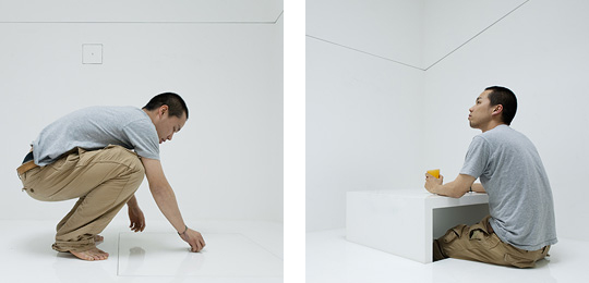
As apparent as it could be, this design is perfect only as a personal space, individuality which can be appreciated by many young professionals. That being stated, it is not adjusted as a definitive family homes, which use a lot of space for all family things that families do, to a simple guest welcoming. It does though gives great potential as homes for single individual communities where a mass arrangement of the houses in a site is very influential and social friendly.

From personal point of view, the house is indeed deeply influential. It gives the definition of a precedent a whole different perspective- unique, unconventional, and futuristic. A simple small box with a whole new meaning, one box I am definitely intrigued to have. I want one.


Images taken from http://www.trendir.com/house-design/micro-compact-home-from-japan-futuristic-paco-house.html

Friday 12 February 2010

A Precedent A Day. Entry #7: Small House


I am using this design as a precedent analysis for the project Research Retreat. Located in attractive areas of Tokyo, Japan, this precedent is architectured by Kazuyo Sejima, in association Ryue Nishizawa. Intended for a small family, the client of this house intended to have a quiet, little space that serves as a appropriate living for small inhabitants.

The first impression is that the house has a simple charming unique design that seems to stand out in the midst of modern Japanese architecture neighbourhood. The house looks charmingly like a tree, said as a weeping willow, a quirky shape that is covered with large panels that tilted in horizontal and vertical direction. Made almost entirely with glass, it is structured about steel shaft with inner spiral stairs. With the advantage of the use of material , it gives a great view from the inside,without giving out too much privacy and too expansive view to the owner's liking, with the glass material facing Sony establishment, where the husband works.


An open staircase is definitely an outstanding feature of the house, that sub-dividing the different function parts of the house. The different levels of the house are apparent to serve as particular purposes for the family needs : bedrooms, space for children, terrace with bath, living/dining/kitchen area. The clever use of functionality saves space and still stands beautiful in the midst of its neighbourhood.

Personally, this house intrigues me the most due to its uniqueness of outer shape. Creating a look that transcends as an innovative contemporary house as what the architect intend to is simply successful. The use of glass as its skin gives it an opaque look that makes it seem elegant and charming. Apart from that, the simplicity design of the house is inspiring which I try to transcend into the Research Retreat design project, an approach I can really relate to, where one design can be simple yet aesthetically amazing.

"Simplicity is the ultimate sophistication" - Leonardo Da Vinci


Images taken from http://www.busyboo.com/2008/10/05/small-house-kazuyo-sejima/

Tuesday 9 February 2010

A Precedent A Day. Entry #6: The Rietveld Schröder House


Located in Utrecht, Netherlands, this intriguing precedent was designed by Dutch architect Gerrit Rietvield in 1924. The client, Mrs Schröder-Schrader commisioned the house to be without a wall. The house is an example of De Stijl-architecture at which it was the only building with such architecture, unbeknownst why there was an architecture named after the artistic movement anyway (a specified architecture of a single building?). The house was resided by Mrs Schröder-Schrader and her three children after her death in 1985. The house was later restored by Berus Mulder as a museum.


The De Stilj, also known as neoplasticism artistic movement is widely known for its geometric and generic colours. The best interpretation of De Stijl movement is the painting Composition of Yellow, Blue and Red by Piet Mondrian, which basically resembles everything there is to the movement, literally, geometric components somposed in a random manner with unexplained blue, red and yellow used as some finishing touches.


The house is a two-storey house with the public area, consisiting of kitchen, dining, living area and a studio while the first floor was to be the private area, where the bedrooms are divided by portable partitions. This feature was generated so as to have big space for the children of the house to play and finally retreat in private at night.

The house is geometric, a repetitive feature that covers the entire precedent. Personally, t lacks innovation and creativity and with bright colours, it looks almost look like panels of mural canvas. That being said, the house has a great aesthetic appeal that makes it stand out in the suburban area of Utrecht, as to being small and simply unique and different. The house itself is not magnificent or totally awesome in a sense, but it does pass for a good architectured house. With common components of a usual house, it has features that set as the beginning of modernism. Apparently, modernism has come a long way till it reaches its peak where it is today.
The composition of geometric components may look a little bit at random, with touch of different colours on different components, which actually is strategically thought of. In example, the door area is painted black as it was the most accessible hence it was due to be soiled.


Though it was not one building that people will consider the building of the century, or remotely one could be influenced, it does have an appeal as one of the houses that have history within, a house that carries the art movement of De Stijl, as good as it gets. Comme Ci, Comme Ça.