Thursday 28 October 2010

A Precedent A Day. Entry #11: Universiteitsbibliotheek Utrecht


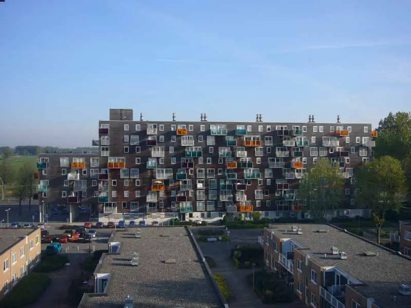
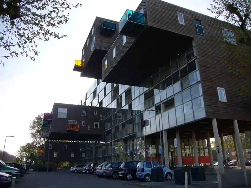
Following the precedent analysis of Netherlands architecture, this building is a continuation from the study trip. As a part of buildings from University of Dundee, this building translated directly into University Library of Utrecht, this piece of architecture is designed by Wiel Arets Architects. Surrounded by various architecture of surrounding buildings, the library stood out with its modest yet rigid exterior that translate as being a lone independent building.


The planning of the entire design of its entirety was taken up to a period of seven years, whereas the construction of the building took three years, half the amount deciding the plan of the building, which is safe to say that the building has been thoroughly prepared and planned.

.

The detailing, through its seven-year long process of analysis and consideration is complimented for its utilization, together with its aesthetic value. The most intriguing part of the building lies not on its exterior but rather to its interior where every feature is meant to have its own purpose, small or big.

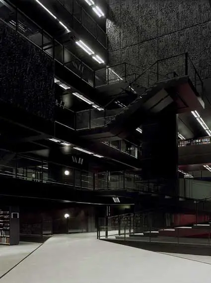
Elements of bamboo leaves are featured on black rectangular panels that are administered as main elements that basically create the library from its wall to its interior. The outer part of the library is cladded with these panels entirely, where one panel illustrates one floor of the building. Whilst lined up as exterior wall of the building, some of the panels at random would extruded outwards to let in natural light into the building, a feature that proved to be essential for a building with a theme color of black. Such color creates elegance and illusion of solidity, beneficial to a place where people retreat to be in a comforting environment where students can study.

On the entrance, one hollowed structure leads upwards towards a skylight on the roof. This clever feature is situated on top of the main stairs leading to the library where it is argued to be high on its level of social interactions between students to and from the inside of the library. High sound intensity would be bounced upwards to the hollowed area where it will dissipate and gradually fade on top of it, hence ensuring quiet environment inside the library area.
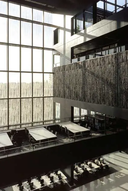

Personally, this building appeals as being an elegant exotic building. With its black color, Universiteitsbibliotheek Utrecht gives a charm that pleases visitors to simply appreciate its bold rigid design. The interior of the library seem to overpower the exterior, making an admirer to be able to truly appreciate design by only entering and walk on every levels of the library. The strong geometric elements of the interior is not being complimented by the organic design on each panel that covered the exterior of the library. Plus, the bamboo design looks like splatters of birds' poop.


A Precedent A Day. Entry #10: Wozoco Apartment


Celebrating the study trip to the Netherlands, it would be highly appropriate if the precedent review would be of buildings from the country, some architecture viewed and analysed along the 5-day journey around Holland, hence presenting the Wozoco Apartment.


Wozoco Apartment lays on the outskirts of Amsterdam and designed by MVRDV Architects. Commissioned by Het Oosten Housing Association , this housing accommodates 100 flats that are occupied by elderly of the area. Disguised as an apartment rather than an old folks home or a nursing home, it distracts from the cliche image of a centre where old people live with caretakers around to care and nurse them in a hospital-like environment.


The original plan by Cornelis Van Eesteren regulated 87 units of apartments per block, where each tenant is promised natural good lighting. Then, the client requested the number of units to be increased by 13 to 100. It proved to be a challenge as the idea to accommodate 13 additional units would have to occupy another floor, a feature that would limit the green common space. Hence, the design of the building, deemed to be provocative and simply original.

The design of the building includes extruding elements from a single box of a building, creating "hanging" structures to the back and front, that would actually place the additional units of flats. Apartments facing the back of the building is completed with a verandah each, with various elements of panels, colors and structures to enhance individuality of each unit. Such feature, random as it seems with some verandah extruding out from cantilevered elements, manage to appear organized as different colors of panels compliment each other with a bold hint of playfulness, shying away from the impressions of old age and death, ironic to its design of modern and contemporary.

The back of the building spreads a garden of flat space, enhancing the quality of light into the verandahs of the flats, cantilevered or not. These would also benefit residences to have a better view, as adjacent buildings to the Wozoco Apartment were low structures that accommodate nurses and caretakers of the old folks in the apartment. The front of the flat, on the other hand is covered with glass panels and wooden cladding on its cantilevered structures, simple without any complexion.


Wozoco Apartment is intriguing as an idea of a modern design that accommodate seniors, two elements that contrast yet compliment each other. The design is also amazing as a structural execution where big elements that cantilever on both sides of the buildings would be able to hold and even accommodate a few apartments. I find myself intrigued by the design and is amazed by its simplicity and complexity that appear to create high aesthetic value and its honesty to appear beautiful without any internal statement where it tries to be meaningful and deep.


Tuesday 19 October 2010

"oh, another blog?"

Stepping to a brand new year, a brand new semester, it does seem a little exciting to realize that I have indeed endured one year of architecture studies in a new country which indefinitely brought me to realizing that I have another three years in this amusingly boring place of Dundee to be blessed upon. The new semester saw me entering a little later than usual which was basically becoming a norm for me lately. Greeted with a brand new project, it was a bit overwhelming after three months of dead lifestyle at home and was unusually happy to be able to design again for the new project, the Shelter project.

The design for this project was undeniably a page taken off from the concept idea of the design from my previous project, the Tower project from the second semester from the first year. The design of the shelter, which was a resemblance of the previous project of rotating elements to the top, which applied to this particular project, a plank. The basic concept for the shelter was to have bottom planks which act as steps and then seats, while the upper part of the planks act as a roof, a complete shelter.

Designing for this project also required one to be attentive to details and even the construction of the whole structure, basically defining in clarity as if constructing the design in a real life situation. With a pole penetrating the centre of the design, it gave a complying connection of touching planks which acted as glue to hold planks together. But alas, the construction was controversial as the durability of each plank horizontally was questioned and justified.

This particular project was overwhelming because the best three designs were to be constructed professionally as a permanent structure on each respective site. Alas, my design was not picked as a final product to be glorified as a complete structure. The follow-up for the project was to assemble other undeserving designers of the shelter project to then create a team which will finally construct the design from scratch to a final structure appropriate on the site, managing from raising own funds to cover the costs of the construction to erecting the whole shelter from ground.

The managing design which I was happily, without any regards at all that I was actually dejected as I have created a design unworthy to an amazing standard, to assist the design by Aoife O'Donnell. The design illustrated an A-shaped hollowed pathway with seats placed inside which through much construction and democracy of adding i's to every single name suggested, branded as The Crux. The team was divided into groups which was to be handling certain aspects of the construction of the site, namely the making and designing, the fundraising and the documentation. I placed myself somehow into the group to documenting, which job was to capturing every detailing of the construction of the shelter from start to finish. Through some discussion with the group or just basically casual talking, I landed myself to another gig of actually writing a blog regarding every little journey of the creation of the shelter, at which I surprisingly find myself agreeing to do. With that, I basically am in charge of another blog, one particular blog I am required to write on every single day as a mere contribution of the team of The Crux. Crux Rox?

The blog for The Crux project is as followed; www.theawesomecrux.blogspot.com

To retract, the blog was discontinued due to some miscommunication with fellow teammates.

Friday 12 March 2010

A Precedent A Day. Entry #9: Fallingwater


A classic piece of architecture, the Fallingwater House is simply one of the most outstanding precedent in the world. Living up to its architect's reputation, Frank Lloyd Wright as one of the leading prominent architects for the last century, it resonates beauty and organic, lying in Pennsylvania, the United States. It served as a weekend home to a succesful businessman, Edgar Kauffman Sr. and his family for over 25 years.

The anecdote where Wright was asked to design the house was indeed interesting. It started when Wright was invited after an itemization of utopian model city to the house of Kauffman, 'La Tourelle', a masterpiece by a local architect, Benno Janssen. Wrigth, without subtlety remarked to Kauffman's son who is also an architecture student of his, Edgar Kauffman Jr., loud enough intending to be overheard by his parents, "Edgar, this house is not worthy of your parents." The boldness of Frank Lloyd Wright is simply powerful and intriguing that Kauffman then contacted Wright to propose a weekend house on one of his property outside Pittsburgh.


The main element of this house is the geographical value of the site. The property site that was intended to build the weekend house was around waterfall, at which to the client's surprise and then approval, the architect decided to have the house on top of the waterfall rather than facing it, hence dubed Fallingwater. The house constructed with little mean to not affect too much on the surrounding of the nature. The house make use of different cantilevers adjacent to each other creating different planes levetating on top of each other. This feature somehow blends nicely with the nature surrounding, organically imitating the formation of stones around the active waterfall that appear to come out beneath the house.

Compliments to Japanese architecture, Wright inspired to create the interior space to be interpenetrate with the exterior of the house, creating harmony between nature and human, according to Tadao Ando. Accustomed with Wright's own unique style and perception of architecture, the house is indeed organic and compliments the nature.


Personally, I want to hate the building for reason that it blends with the environment of nature too much, making use of the beauty of nature rather than the purpose of design. But, the design of the house does not seem to fade or made transparent by the magnificent of the nature. On the contrary, the house stands out and the architecture design definitely transfers beautifully. Fallingwater is one house that remains to inspire people and gives a good literal meaning of great art and architecture. An icon.


Sunday 7 March 2010

"you can change it if you want..."

I have not written a journal for quite a long time. Something personal, something I experienced in my days of life as a first year Architectural student. Here it goes.

On 5th of March, there held an interim review on the Research Retreat, 2 weeks into the project. This project, based on a site in Hospitalfeld is to design a place for artists internationally to retreat and have personal space for work, to create new pieces in confinement. The requirement for the project proposal is to have six personal homes/studios, a communal place for the inhabitants including a public kitchen and a gallery.

The basic concept of my design is to have something simple yet intriguing which is to contrast with the microcosmos nature of the site that are covered with trees and flowers, features that are deep in complexity, something that is brought up during the previous Mediator project. The design of the structure started as doodles in the sketchbook, simple slanted structure which could allocate all different functions inside one structure. Upon trying it out on the Google SketchUp, the design of the house seemed too two-dimensional, too flat and plain. Hence, I played with the shape of the structure which brought to the now design shape of the project, an approach I most keen on.

My approach for the project is understandable as completely different, which is creating three towers that could allocate all six homes/studios with different structure for the gallery and communal place.

Having said that, during the review, problems regarding the idea is compiled - the positions of the towers which could benefit the northern light, the orientation of structure functionality, the difference and advantages of the upper and lower homes inside the tower, and basically the whole design itself. One said that the shape of the tower is pointless at which he exclaimed, "This is your design, you can change it if you want." Subtle.

But one did encourage the whole conceptuality of the design and to pursue it. Backing up the design, he required for solid solutions regarding the problems of the tower which to an extend of requiring to have not one, but a few 1:50 scaled models of the tower which are all due this week.

Personally, I do believe in this design and hope to be able to have it as the final product. I am getting into the project that I find myself excited in my own design and feeling rather proud not to change the whole basic idea which alas, seem quite self-indulged?

Saturday 27 February 2010

A Precedent A Day. Entry #8: PACO House


This particular design approaches as an innovation rather than basic home design. Initiated by Jo Nagasaka and Schemata Architects, the house is produced in mass, making it a product rather than a design building. This unconventional approach of a habitat proved to be a working design. Measuring at three metres square, this design compliments its simple shape without disrupting the surrounding, due to its space efficiency and its feature that is easily assembled, making the possibility of geographic placement is endless.


The look of this house is simply chic and elegance. Plain sleek white square, it appeals as a with a lid that can be opened or shut, committing completely with having full natural light into the home. Like mimicking a child's simple mind to keep a miniature pet inside a box, it resembles just as that- a small box that serves all the basic of human necessities.


The beauty of the house, does not lie in the aesthetic of the exterior of the building, but rather inside, where the innovation of the architects is cleverly underlined and capitalized. The interior, though one room, is completely utilized with features of different needs - hammocks as sleeping quarters, waterproof partition wall as shower space, pop-up toilet, concealable table for dining which also includes additional sleeping space and storage space.


As apparent as it could be, this design is perfect only as a personal space, individuality which can be appreciated by many young professionals. That being stated, it is not adjusted as a definitive family homes, which use a lot of space for all family things that families do, to a simple guest welcoming. It does though gives great potential as homes for single individual communities where a mass arrangement of the houses in a site is very influential and social friendly.

From personal point of view, the house is indeed deeply influential. It gives the definition of a precedent a whole different perspective- unique, unconventional, and futuristic. A simple small box with a whole new meaning, one box I am definitely intrigued to have. I want one.


Images taken from http://www.trendir.com/house-design/micro-compact-home-from-japan-futuristic-paco-house.html

Friday 12 February 2010

A Precedent A Day. Entry #7: Small House


I am using this design as a precedent analysis for the project Research Retreat. Located in attractive areas of Tokyo, Japan, this precedent is architectured by Kazuyo Sejima, in association Ryue Nishizawa. Intended for a small family, the client of this house intended to have a quiet, little space that serves as a appropriate living for small inhabitants.

The first impression is that the house has a simple charming unique design that seems to stand out in the midst of modern Japanese architecture neighbourhood. The house looks charmingly like a tree, said as a weeping willow, a quirky shape that is covered with large panels that tilted in horizontal and vertical direction. Made almost entirely with glass, it is structured about steel shaft with inner spiral stairs. With the advantage of the use of material , it gives a great view from the inside,without giving out too much privacy and too expansive view to the owner's liking, with the glass material facing Sony establishment, where the husband works.


An open staircase is definitely an outstanding feature of the house, that sub-dividing the different function parts of the house. The different levels of the house are apparent to serve as particular purposes for the family needs : bedrooms, space for children, terrace with bath, living/dining/kitchen area. The clever use of functionality saves space and still stands beautiful in the midst of its neighbourhood.

Personally, this house intrigues me the most due to its uniqueness of outer shape. Creating a look that transcends as an innovative contemporary house as what the architect intend to is simply successful. The use of glass as its skin gives it an opaque look that makes it seem elegant and charming. Apart from that, the simplicity design of the house is inspiring which I try to transcend into the Research Retreat design project, an approach I can really relate to, where one design can be simple yet aesthetically amazing.

"Simplicity is the ultimate sophistication" - Leonardo Da Vinci


Images taken from http://www.busyboo.com/2008/10/05/small-house-kazuyo-sejima/

Tuesday 9 February 2010

A Precedent A Day. Entry #6: The Rietveld Schröder House


Located in Utrecht, Netherlands, this intriguing precedent was designed by Dutch architect Gerrit Rietvield in 1924. The client, Mrs Schröder-Schrader commisioned the house to be without a wall. The house is an example of De Stijl-architecture at which it was the only building with such architecture, unbeknownst why there was an architecture named after the artistic movement anyway (a specified architecture of a single building?). The house was resided by Mrs Schröder-Schrader and her three children after her death in 1985. The house was later restored by Berus Mulder as a museum.


The De Stilj, also known as neoplasticism artistic movement is widely known for its geometric and generic colours. The best interpretation of De Stijl movement is the painting Composition of Yellow, Blue and Red by Piet Mondrian, which basically resembles everything there is to the movement, literally, geometric components somposed in a random manner with unexplained blue, red and yellow used as some finishing touches.


The house is a two-storey house with the public area, consisiting of kitchen, dining, living area and a studio while the first floor was to be the private area, where the bedrooms are divided by portable partitions. This feature was generated so as to have big space for the children of the house to play and finally retreat in private at night.

The house is geometric, a repetitive feature that covers the entire precedent. Personally, t lacks innovation and creativity and with bright colours, it looks almost look like panels of mural canvas. That being said, the house has a great aesthetic appeal that makes it stand out in the suburban area of Utrecht, as to being small and simply unique and different. The house itself is not magnificent or totally awesome in a sense, but it does pass for a good architectured house. With common components of a usual house, it has features that set as the beginning of modernism. Apparently, modernism has come a long way till it reaches its peak where it is today.
The composition of geometric components may look a little bit at random, with touch of different colours on different components, which actually is strategically thought of. In example, the door area is painted black as it was the most accessible hence it was due to be soiled.


Though it was not one building that people will consider the building of the century, or remotely one could be influenced, it does have an appeal as one of the houses that have history within, a house that carries the art movement of De Stijl, as good as it gets. Comme Ci, Comme Ça.