Saturday 7 May 2011

AR22005; Written Communications

Intervention Project: What is your response to the existing building and why?

Situated on a sloping location of South Dudhope Works, Tayside, Dundee, the site for the Intervention Project is for the Tayside Recycling Centre of Tayside Foundation for the Conservation of Resources (TFCR).

The main entrance via Douglas Street is directly from the Tayside Recycling Centre itself, while another alternate entrance to the site of the north-west corner of the rectangular area is on the Park Street, a level-increasing street to the north situated on the west side. This increment of levels illustrates the nature of the location itself where the south side of the site is facing the river while the north side the hill part of Dundee, the Dudhope Park. Situated opposite Blackness Trading Precinct with many precedents surrounding such as warehouses, sawmills and factories adopting early nineteenth century industrial architecture with common red brick with limestone materiality underlines the area as being an industrial zone area, where a nature of industrial spirit is transparent on the site. A public access does not seem to appeal to the site, which acts as a pass-by for any civilians rather than an actual destination.

With aged thick walls lining the site, the open free area is limited as erecting structures stand on its sides, making it appears smaller than it actually is. The walls, weathered by age, accumulate dirt, wild shrubs and garbage which make the site a dangerous and unappealing for a public to access. The texture of the wall remains untouched with the rawness of the bricks materiality, bringing honesty and integrity to the site. This captures the spirit of Victorian era, where architects appreciate the genuine materiality of a structure and elevate its rawness as honesty to architecture (Rasmussen S. E., 1959). As a subjective perspective, the aesthetic value is seen to be higher in rough surfaces rather than in smoothly polished surface. Though being imperfect on its structural where the walls are misshaped due to maybe endurance of weather as maintenance were minimal to none, the walls create a distinction and uniqueness which brings character to the site.

Visitors to the Tayside Recycling Centre are welcomed with an expansive canopy in a structural fashion as an entrance from Douglas Street. This illustrates a grand gesture of welcoming similar to the Pantheon in Rome, which unlike the pantheon; it leads to the ironically small and secluded site. Walking underneath the canopy, it easily creates an illusion of a big space of the entire site and even the recycling centre itself, making the first impression of viewing of the actual site deeply underwhelming. The big canopy is also used as a roofed parking space. The structural nature of the canopy imitates the common low-cost factory roofs and warehouses, where the canopy is propped up by steel framing and laminated with zinc, parallel to its nature of an industrial area. Case in point, the Drogheda Port-able Warehouse, it introduces a low-cost structure that is easy to build and illustrates a massive space to store a big pile inside.

Facing an existing building of the recycling centre, the site appears to be dark as shadows casted by the big building cover the area with most open space. Within the wall, on the other hand, sunlight intensity appears to be higher for it lies on a less shaded space. An elevated plane borders the south-west side due to the hilly nature of the location making a definite good view not well underlined. These features are simply mere unique features that are fascinating for a new emerging form that can be erecting within the earth, as much as the approach of architects such as Tadao Ando who intertwine the elements of the environmental nature itself, unique to its own to his design, making use of spatial of light (Nute, K. 2004).
Being characterized as an industrial area, the site evokes exactly that. The existing buildings remain with their nature of industrial elements and simplicity of materiality, alongside their own industrial purposes and utilizations. With its rawness and honesty in architecture design, it is easy to translate the spirit inside as being a recycling centre that captures the seclusion and disconnection to public interests. Though the site easily appears to be for lack of better words, “a dump”, it captures a sense of rawness and honesty that are indeed simply beautiful.


Bibliography
Rasmussen S. E., 1959, Experiencing Architecture, The MIT Press
Nute, K., 2004, Place, Time, And Being In Japanese Architecture, Routledge


Friday 6 May 2011

A Precedent A Day. Entry #12: Gehry Residence


Frank Gehry, considered to be the pioneer of deconstructivism, architected this house that changed the face of architecture. Located in Santa Monica, originally a pink house founded by Gehry's wife, was to be transformed with the principle by Gehry, 'balance of fragment and whole, raw and refined, new and old'.


Finished in 1978, the house stood with an abstract look that seems alien within the conservative neighbourhood, or any neighbourhood for that matters. Within the original house, a side of it was taken apart to accommodate the kitchen, leaving the internal construction visible. Creating controversies, the extension of the house was made by Gehry with the concept of jutting angles and mixed materials making them prominent features of the house.


Gehry's design of the house would not be something that I would enjoy, and even to live in. Being an admirer of architecture with sleek designs, I am adamant at Gehry's which does not seem to have a proper structure that it left looking unfinished and awkward within the neighbourhood. The abstract integrity is also hard to be appreciated just due to the fact that the quality of abstract itself, which seems flimsy when applied to architecture. In contrast with the design, I always believe that architecture must have an essence of solidity, in line with one of the three qualities of architecture brought forward by vitruvius- firmitas. The prospect of living also does seem negative as it appears to not have a safe and calm environment. The random combustion of materials of the house creates a chaotic movement which would be unsettling to wake up every day to and curious children would be left to explore these jutted angles that appeal like a playground and prone themselves to accidents by jutted angles' edges.

Thursday 28 October 2010

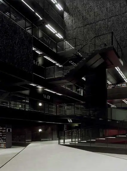
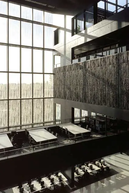
A Precedent A Day. Entry #11: Universiteitsbibliotheek Utrecht


Following the precedent analysis of Netherlands architecture, this building is a continuation from the study trip. As a part of buildings from University of Dundee, this building translated directly into University Library of Utrecht, this piece of architecture is designed by Wiel Arets Architects. Surrounded by various architecture of surrounding buildings, the library stood out with its modest yet rigid exterior that translate as being a lone independent building.


The planning of the entire design of its entirety was taken up to a period of seven years, whereas the construction of the building took three years, half the amount deciding the plan of the building, which is safe to say that the building has been thoroughly prepared and planned.

.

The detailing, through its seven-year long process of analysis and consideration is complimented for its utilization, together with its aesthetic value. The most intriguing part of the building lies not on its exterior but rather to its interior where every feature is meant to have its own purpose, small or big.

Elements of bamboo leaves are featured on black rectangular panels that are administered as main elements that basically create the library from its wall to its interior. The outer part of the library is cladded with these panels entirely, where one panel illustrates one floor of the building. Whilst lined up as exterior wall of the building, some of the panels at random would extruded outwards to let in natural light into the building, a feature that proved to be essential for a building with a theme color of black. Such color creates elegance and illusion of solidity, beneficial to a place where people retreat to be in a comforting environment where students can study.

On the entrance, one hollowed structure leads upwards towards a skylight on the roof. This clever feature is situated on top of the main stairs leading to the library where it is argued to be high on its level of social interactions between students to and from the inside of the library. High sound intensity would be bounced upwards to the hollowed area where it will dissipate and gradually fade on top of it, hence ensuring quiet environment inside the library area.


Personally, this building appeals as being an elegant exotic building. With its black color, Universiteitsbibliotheek Utrecht gives a charm that pleases visitors to simply appreciate its bold rigid design. The interior of the library seem to overpower the exterior, making an admirer to be able to truly appreciate design by only entering and walk on every levels of the library. The strong geometric elements of the interior is not being complimented by the organic design on each panel that covered the exterior of the library. Plus, the bamboo design looks like splatters of birds' poop.


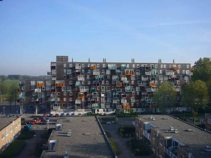
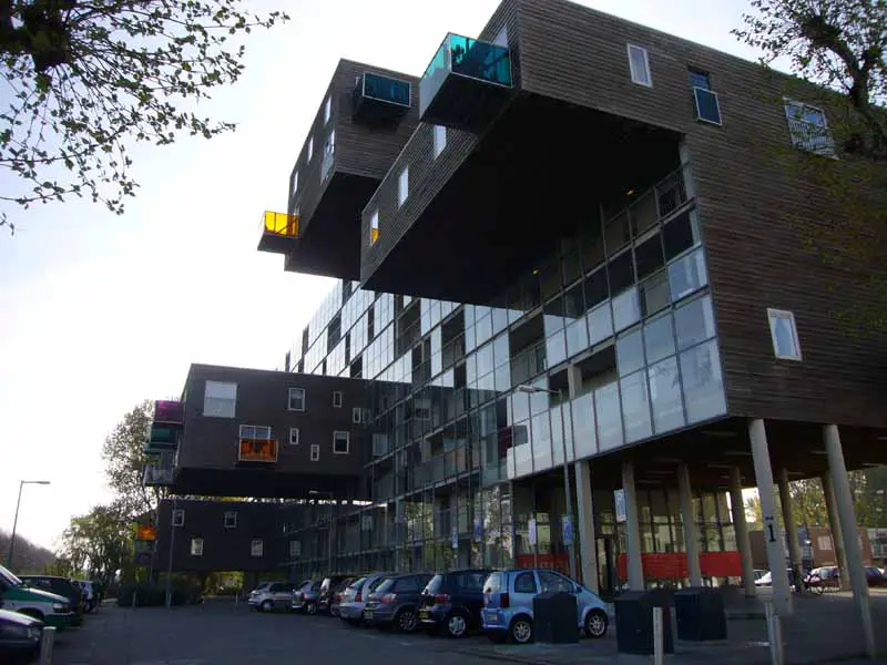
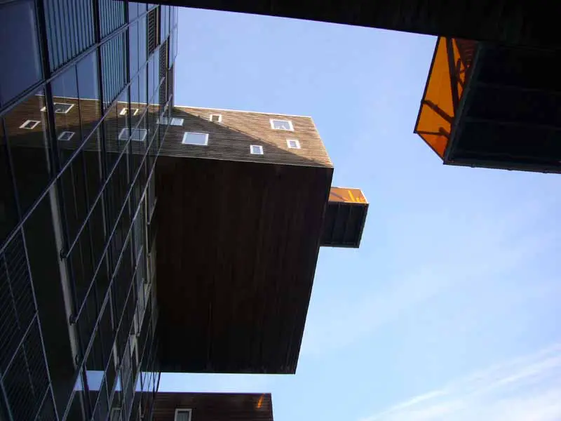
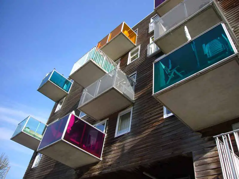
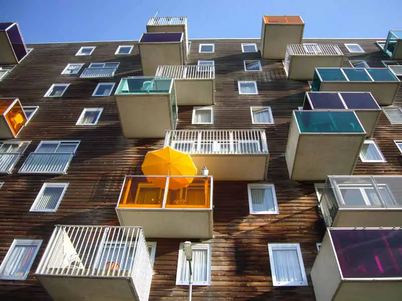
A Precedent A Day. Entry #10: Wozoco Apartment


Celebrating the study trip to the Netherlands, it would be highly appropriate if the precedent review would be of buildings from the country, some architecture viewed and analysed along the 5-day journey around Holland, hence presenting the Wozoco Apartment.


Wozoco Apartment lays on the outskirts of Amsterdam and designed by MVRDV Architects. Commissioned by Het Oosten Housing Association , this housing accommodates 100 flats that are occupied by elderly of the area. Disguised as an apartment rather than an old folks home or a nursing home, it distracts from the cliche image of a centre where old people live with caretakers around to care and nurse them in a hospital-like environment.


The original plan by Cornelis Van Eesteren regulated 87 units of apartments per block, where each tenant is promised natural good lighting. Then, the client requested the number of units to be increased by 13 to 100. It proved to be a challenge as the idea to accommodate 13 additional units would have to occupy another floor, a feature that would limit the green common space. Hence, the design of the building, deemed to be provocative and simply original.

The design of the building includes extruding elements from a single box of a building, creating "hanging" structures to the back and front, that would actually place the additional units of flats. Apartments facing the back of the building is completed with a verandah each, with various elements of panels, colors and structures to enhance individuality of each unit. Such feature, random as it seems with some verandah extruding out from cantilevered elements, manage to appear organized as different colors of panels compliment each other with a bold hint of playfulness, shying away from the impressions of old age and death, ironic to its design of modern and contemporary.

The back of the building spreads a garden of flat space, enhancing the quality of light into the verandahs of the flats, cantilevered or not. These would also benefit residences to have a better view, as adjacent buildings to the Wozoco Apartment were low structures that accommodate nurses and caretakers of the old folks in the apartment. The front of the flat, on the other hand is covered with glass panels and wooden cladding on its cantilevered structures, simple without any complexion.


Wozoco Apartment is intriguing as an idea of a modern design that accommodate seniors, two elements that contrast yet compliment each other. The design is also amazing as a structural execution where big elements that cantilever on both sides of the buildings would be able to hold and even accommodate a few apartments. I find myself intrigued by the design and is amazed by its simplicity and complexity that appear to create high aesthetic value and its honesty to appear beautiful without any internal statement where it tries to be meaningful and deep.


Tuesday 19 October 2010

"oh, another blog?"

Stepping to a brand new year, a brand new semester, it does seem a little exciting to realize that I have indeed endured one year of architecture studies in a new country which indefinitely brought me to realizing that I have another three years in this amusingly boring place of Dundee to be blessed upon. The new semester saw me entering a little later than usual which was basically becoming a norm for me lately. Greeted with a brand new project, it was a bit overwhelming after three months of dead lifestyle at home and was unusually happy to be able to design again for the new project, the Shelter project.

The design for this project was undeniably a page taken off from the concept idea of the design from my previous project, the Tower project from the second semester from the first year. The design of the shelter, which was a resemblance of the previous project of rotating elements to the top, which applied to this particular project, a plank. The basic concept for the shelter was to have bottom planks which act as steps and then seats, while the upper part of the planks act as a roof, a complete shelter.

Designing for this project also required one to be attentive to details and even the construction of the whole structure, basically defining in clarity as if constructing the design in a real life situation. With a pole penetrating the centre of the design, it gave a complying connection of touching planks which acted as glue to hold planks together. But alas, the construction was controversial as the durability of each plank horizontally was questioned and justified.

This particular project was overwhelming because the best three designs were to be constructed professionally as a permanent structure on each respective site. Alas, my design was not picked as a final product to be glorified as a complete structure. The follow-up for the project was to assemble other undeserving designers of the shelter project to then create a team which will finally construct the design from scratch to a final structure appropriate on the site, managing from raising own funds to cover the costs of the construction to erecting the whole shelter from ground.

The managing design which I was happily, without any regards at all that I was actually dejected as I have created a design unworthy to an amazing standard, to assist the design by Aoife O'Donnell. The design illustrated an A-shaped hollowed pathway with seats placed inside which through much construction and democracy of adding i's to every single name suggested, branded as The Crux. The team was divided into groups which was to be handling certain aspects of the construction of the site, namely the making and designing, the fundraising and the documentation. I placed myself somehow into the group to documenting, which job was to capturing every detailing of the construction of the shelter from start to finish. Through some discussion with the group or just basically casual talking, I landed myself to another gig of actually writing a blog regarding every little journey of the creation of the shelter, at which I surprisingly find myself agreeing to do. With that, I basically am in charge of another blog, one particular blog I am required to write on every single day as a mere contribution of the team of The Crux. Crux Rox?

The blog for The Crux project is as followed; www.theawesomecrux.blogspot.com

To retract, the blog was discontinued due to some miscommunication with fellow teammates.

Friday 12 March 2010

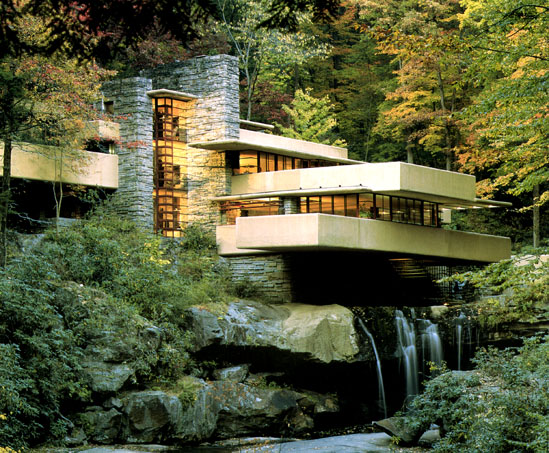
A Precedent A Day. Entry #9: Fallingwater


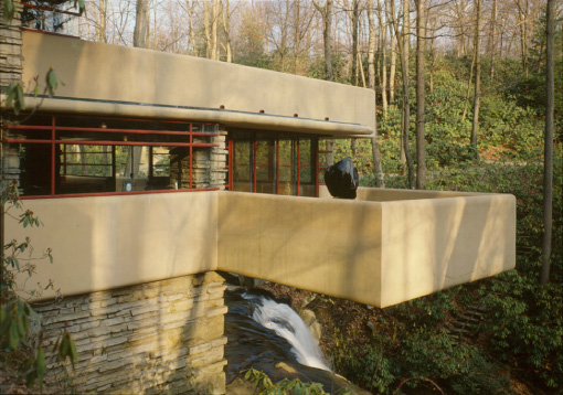
A classic piece of architecture, the Fallingwater House is simply one of the most outstanding precedent in the world. Living up to its architect's reputation, Frank Lloyd Wright as one of the leading prominent architects for the last century, it resonates beauty and organic, lying in Pennsylvania, the United States. It served as a weekend home to a succesful businessman, Edgar Kauffman Sr. and his family for over 25 years.

The anecdote where Wright was asked to design the house was indeed interesting. It started when Wright was invited after an itemization of utopian model city to the house of Kauffman, 'La Tourelle', a masterpiece by a local architect, Benno Janssen. Wrigth, without subtlety remarked to Kauffman's son who is also an architecture student of his, Edgar Kauffman Jr., loud enough intending to be overheard by his parents, "Edgar, this house is not worthy of your parents." The boldness of Frank Lloyd Wright is simply powerful and intriguing that Kauffman then contacted Wright to propose a weekend house on one of his property outside Pittsburgh.


The main element of this house is the geographical value of the site. The property site that was intended to build the weekend house was around waterfall, at which to the client's surprise and then approval, the architect decided to have the house on top of the waterfall rather than facing it, hence dubed Fallingwater. The house constructed with little mean to not affect too much on the surrounding of the nature. The house make use of different cantilevers adjacent to each other creating different planes levetating on top of each other. This feature somehow blends nicely with the nature surrounding, organically imitating the formation of stones around the active waterfall that appear to come out beneath the house.

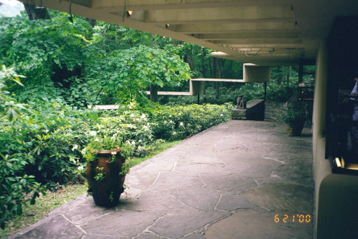
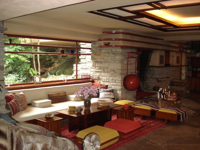
Compliments to Japanese architecture, Wright inspired to create the interior space to be interpenetrate with the exterior of the house, creating harmony between nature and human, according to Tadao Ando. Accustomed with Wright's own unique style and perception of architecture, the house is indeed organic and compliments the nature.


Personally, I want to hate the building for reason that it blends with the environment of nature too much, making use of the beauty of nature rather than the purpose of design. But, the design of the house does not seem to fade or made transparent by the magnificent of the nature. On the contrary, the house stands out and the architecture design definitely transfers beautifully. Fallingwater is one house that remains to inspire people and gives a good literal meaning of great art and architecture. An icon.


Sunday 7 March 2010

"you can change it if you want..."

I have not written a journal for quite a long time. Something personal, something I experienced in my days of life as a first year Architectural student. Here it goes.

On 5th of March, there held an interim review on the Research Retreat, 2 weeks into the project. This project, based on a site in Hospitalfeld is to design a place for artists internationally to retreat and have personal space for work, to create new pieces in confinement. The requirement for the project proposal is to have six personal homes/studios, a communal place for the inhabitants including a public kitchen and a gallery.

The basic concept of my design is to have something simple yet intriguing which is to contrast with the microcosmos nature of the site that are covered with trees and flowers, features that are deep in complexity, something that is brought up during the previous Mediator project. The design of the structure started as doodles in the sketchbook, simple slanted structure which could allocate all different functions inside one structure. Upon trying it out on the Google SketchUp, the design of the house seemed too two-dimensional, too flat and plain. Hence, I played with the shape of the structure which brought to the now design shape of the project, an approach I most keen on.

My approach for the project is understandable as completely different, which is creating three towers that could allocate all six homes/studios with different structure for the gallery and communal place.

Having said that, during the review, problems regarding the idea is compiled - the positions of the towers which could benefit the northern light, the orientation of structure functionality, the difference and advantages of the upper and lower homes inside the tower, and basically the whole design itself. One said that the shape of the tower is pointless at which he exclaimed, "This is your design, you can change it if you want." Subtle.

But one did encourage the whole conceptuality of the design and to pursue it. Backing up the design, he required for solid solutions regarding the problems of the tower which to an extend of requiring to have not one, but a few 1:50 scaled models of the tower which are all due this week.

Personally, I do believe in this design and hope to be able to have it as the final product. I am getting into the project that I find myself excited in my own design and feeling rather proud not to change the whole basic idea which alas, seem quite self-indulged?